Every year, thousands of patients in hospitals and pharmacies nearly get the wrong medicine-not because of a mistake in dosage, but because two drug names look too similar. Tall-man lettering is a simple, low-cost fix that’s been saving lives for over two decades. It doesn’t require new machines, extra staff, or expensive software. It just changes how drug names are written on screens, labels, and prescriptions. And if you work in a pharmacy, ER, or hospital unit, you’ve probably seen it without even realizing it.
What Tall-Man Lettering Actually Does
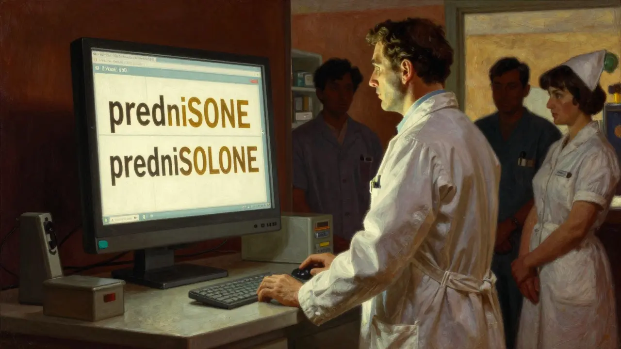
Tall-man lettering highlights the parts of drug names that are different. Instead of writing prednisone and prednisolone in all lowercase, you write them as predniSONE and predniSOLONE. The capitalized letters-SONE and SOLONE-jump out visually. Your brain doesn’t have to work as hard to spot the difference. It’s like putting a red dot on the one thing that matters.This isn’t just about looks. It’s about stopping errors before they happen. In fast-paced environments like emergency rooms or busy pharmacies, staff are juggling dozens of prescriptions. A quick glance at a screen can mean the difference between giving a patient the right drug or a dangerously similar one. Look-alike, sound-alike (LASA) drugs are a known risk. Hydromorphone and morphine. Clonazepam and clonidine. Alprazolam and lorazepam. These aren’t rare cases. They’re everyday risks.
How It Works: The Rules
There’s no single global standard, but most systems follow the same logic:- Start from the left side of the name and capitalize the first group of letters that differ.
- Don’t capitalize the whole word-just the key differentiating part.
- Keep it readable. No all-caps or weird fonts.
Examples from real practice:
- vinBLAStine vs. vinCRIStine - the BLAST and CRIST stand out
- CISplatin vs. CARBOplatin - CIS and CARBO are highlighted
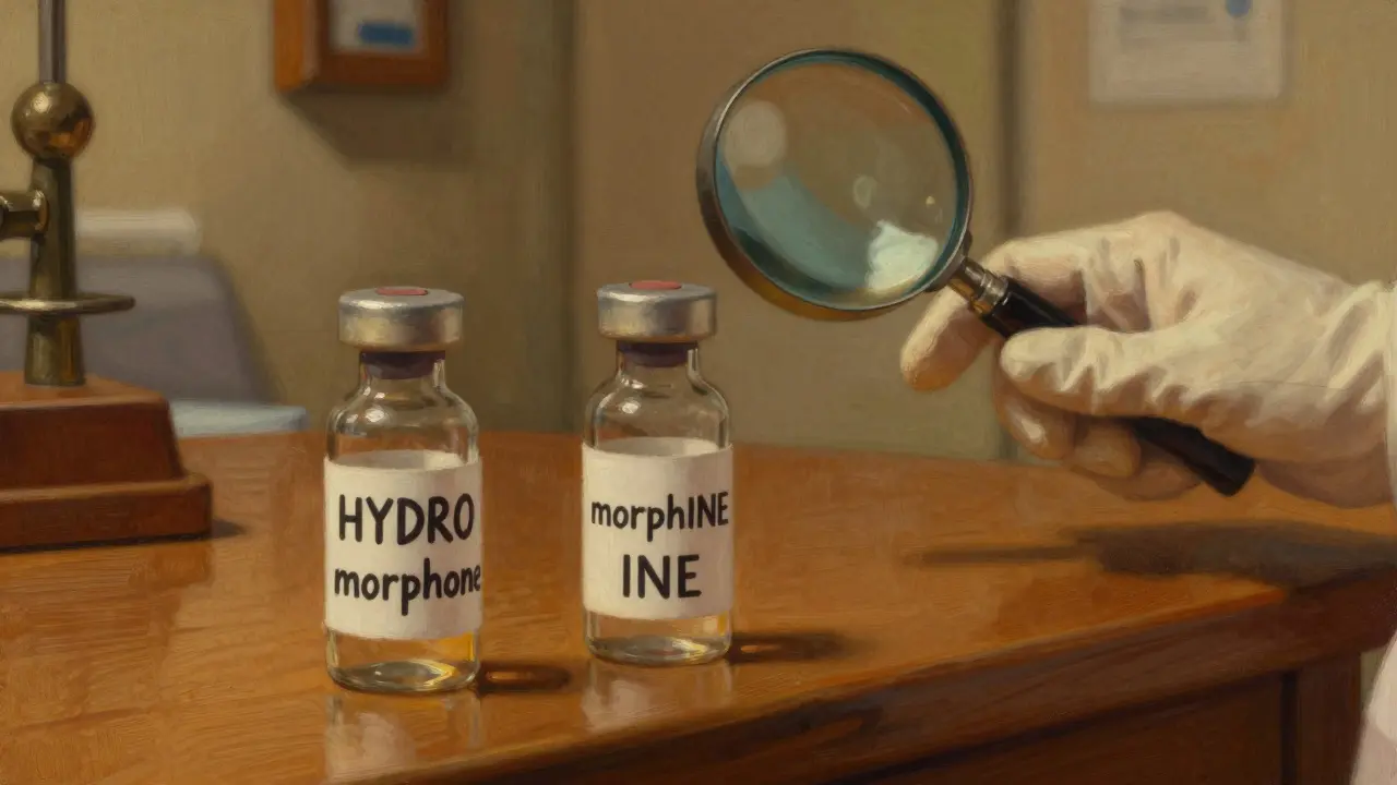
- HYDROmorphone vs. morphINE - HYDRO and INE catch the eye
These aren’t random choices. They’re based on decades of research from the Institute for Safe Medication Practices (ISMP) and the U.S. Food and Drug Administration (FDA). The FDA’s 2023 list includes 72 drug pairs that require tall-man lettering. ISMP’s list is even longer-252 pairs-and gets updated every quarter. Australia and New Zealand use similar lists, with their own 192 approved pairs.
Where You’ll See It
Tall-man lettering isn’t just on paper. It’s built into the digital systems that run modern healthcare:- Electronic Health Records (EHRs) like Epic, Cerner, and Meditech
- Automated dispensing cabinets (like Pyxis machines)
- Prescription labels printed at the pharmacy
- Drug packaging from manufacturers
- Computerized provider order entry (CPOE) screens
In a hospital in Wellington, a nurse pulls up a patient’s medication list. She sees PARoxetine instead of paroxetine. The capital P tells her it’s paroxetine, not another SSRI. She doesn’t pause. She doesn’t second-guess. That’s the point.
Does It Actually Work?
Some studies say yes. Others say maybe. But the real-world evidence is clear.In 2004, ISMP ran an eye-tracking study. Nurses and pharmacists were shown two drug names on a screen-one in standard text, one with tall-man lettering. When names were written normally, they made errors 1 in 5 times. With tall-man lettering? Errors dropped by 35%. That’s not a lab trick. That’s real human behavior under pressure.
A 2022 study in a 500-bed hospital in New Zealand tracked alert overrides after implementing tall-man lettering across 13 systems. Over six months, the number of times staff ignored warnings for LASA drugs dropped by 42%. That’s not just fewer mistakes. That’s fewer near-misses that could have turned into harm.
But it’s not perfect. A 2016 study of 42 children’s hospitals found no significant drop in errors after tall-man lettering was adopted. Why? Because many hospitals only implemented it in one system-like the EHR-but not in the automated dispensing machines or the printed labels. If the drug name looks different on the screen than on the bottle, you’re not helping. You’re confusing people more.
The Big Problem: Inconsistent Implementation
The biggest threat to tall-man lettering isn’t the technique itself. It’s inconsistency.One hospital writes FLUoxetine. The pharmacy down the street writes fluOXETINE. The community pharmacy uses fluoxetine with no capitals. The nurse doesn’t know which one to trust. A 2022 survey found 63% of pharmacists said inconsistent application across systems created more confusion than it solved.
Even worse, different organizations use different rules. The FDA recommends HYDROcodone and oxyCODONE. ISMP recommends the same, but some EHR vendors default to different patterns. A pharmacist in Auckland told me: “I spent 20 minutes once trying to figure out if a patient was on metoprolol or methyldopa. The tall-man letters were on the first syllable-MET and METH-but the font was so small I couldn’t tell the difference. That’s not safety. That’s a trap.”
How to Implement It Right
If you’re responsible for rolling this out, here’s what actually works:- Assemble a team: Pharmacist, IT specialist, nurse, and a safety officer. Don’t skip anyone.
- Use ISMP’s or FDA’s official list-don’t make up your own.
- Apply it everywhere: EHR, dispensing machines, labels, printed forms. If it’s not consistent, it’s useless.
- Test it. Don’t just turn it on. Watch how staff interact with it. Are they missing the capitals? Is the font too small? Adjust.
- Train everyone. Not just pharmacists. Nurses, doctors, even admin staff who enter orders.
- Monitor. Track how often LASA alerts are overridden. If the number doesn’t drop, something’s wrong.
One hospital in Dunedin spent 16 weeks getting it right. They didn’t rush. They tested every system. They fixed font sizes. They standardized across vendors. Within a year, their medication error rate dropped by 27%. That’s not magic. That’s good process.

What Experts Really Think
Dr. Michael Cohen from ISMP says it best: “Tall-man lettering is not a panacea. It’s one layer.”It’s not a replacement for barcode scanning, double-checks, or automated alerts. But it’s a powerful visual cue that works even when everything else fails. A doctor in a rush. A nurse with 10 patients. A pharmacy closing at midnight. In those moments, a capitalized letter can be the last line of defense.
The American Society of Health-System Pharmacists (ASHP) gives it a Grade B recommendation-meaning “use it, but don’t rely on it alone.” The Cochrane Collaboration says the evidence for reducing actual harm is still low, but the evidence for reducing selection errors is moderate. That’s enough to justify it.
Some critics argue we should focus on forcing functions-like systems that block you from selecting the wrong drug entirely. That’s great. But those systems are expensive, complex, and not everywhere. Tall-man lettering? It costs next to nothing. A hospital in Christchurch spent AU$1,200 to update all their systems. They didn’t need new hardware. Just a software patch.
The Future: AI and Standardization
The FDA and ISMP are finally working together to create one unified list of tall-man lettering rules. Expected in mid-2024, this will end the confusion between systems. That’s huge.Some vendors are even testing AI that adjusts tall-man lettering in real time based on past errors. Epic Systems piloted this in 15 hospitals. The AI noticed that staff kept confusing metoprolol and methyldopa, so it started highlighting the TO and THY parts more boldly. Errors dropped another 29%.
But even with AI, voice recognition, and robots dispensing pills, tall-man lettering isn’t going away. Why? Because humans still read screens. Humans still make quick decisions. And sometimes, the only thing standing between a patient and a mistake is a single capitalized letter.
Final Thought: It’s Simple, But It Matters
You don’t need a PhD to use tall-man lettering. You just need to pay attention. If you’re writing a prescription, check the name. Is it clear? Are the key differences visible? If you’re coding a system, make sure it’s consistent. If you’re a patient, ask: “Is this the right drug?”Medication errors aren’t about bad people. They’re about bad systems. Tall-man lettering is a small change that fixes a big problem. And in healthcare, sometimes that’s all you need.
What is tall-man lettering?
Tall-man lettering is a typographic method that uses selective capitalization in drug names to visually distinguish look-alike, sound-alike (LASA) medications. For example, writing "predniSONE" instead of "prednisone" helps prevent mix-ups with "predniSOLONE" by highlighting the key difference in the name.
Which organizations recommend tall-man lettering?
The U.S. Food and Drug Administration (FDA), the Institute for Safe Medication Practices (ISMP), Australia’s National Mixed-Case Lettering List, and New Zealand’s health safety agencies all officially recommend tall-man lettering. The Joint Commission also requires its use in accredited hospitals under National Patient Safety Goal NPSG.01.01.01.
Does tall-man lettering reduce medication errors?
Yes, in real-world settings where it’s applied consistently. Studies show a 35% reduction in selection errors during simulated prescribing tasks. Hospitals that implemented it fully across all systems saw error rates drop by 25-42%. However, inconsistent use across systems can reduce its effectiveness or even increase confusion.
What are common mistakes when implementing tall-man lettering?
Common mistakes include applying it only in one system (like the EHR) but not in dispensing machines or printed labels, using inconsistent capitalization rules between vendors, choosing fonts that are too small to read clearly, and failing to train staff on how to interpret the capitalization. Without full system alignment, it becomes a source of confusion, not safety.
Is tall-man lettering used in New Zealand?
Yes. New Zealand follows similar safety standards as Australia and the U.S. Most public hospitals and large pharmacy chains use tall-man lettering in electronic systems and printed labels. The New Zealand Medicines Safety Unit actively promotes its use and aligns with the Australian National Mixed-Case Lettering List.
Can tall-man lettering replace other safety measures like barcode scanning?
No. Tall-man lettering is a visual aid, not a forcing function. It works best as part of a layered safety approach that includes barcode scanning, double-checks, automated alerts, and staff training. Relying on it alone can create a false sense of security. It’s a backup, not a replacement.


Comments(8)